

art in all its forms

5/29/10
The cycle will not be broken // the message will be revealed
5/27/10
KIN and 12 THE BAND in San Fernando!

KIN:
Hittin The South Land Friday >>> Hard
12 THE BAND:
People of the World.Word on the street is that it is the best live show in town so we're taking it to Sando. If you heard the "Kin n 12 Buzz" but couldn't make it to town people we are coming to you. Come early and find your space.
Date: Friday 28th May 2010
Venue: Blue Martini on Sutton St. in San Fernando
Time: 9pm
Adm: $40TT
In the meantime click on this link and check out one of the best video's produced in TnT
http://www.youtube.com/watch?v=mDvU1SUEXFI
God Bless,
Sheli

WATCH 12 the band's video for their track "Prosper" BELOW:
AND read more here.

5/23/10
The walls are plastered with election stuff

"Apparently graffiti is only legal and accepted around election time," writes Seon Thompson at his blog Copy Book Page. SEE more here.
Plays in French and Spanish at UWI

From a production of Yasmina Rena's 1994 play Art, staged during the 2008/2009 season at the Steppenwolf, Chicago
FROM THE ORGANISERS:
Centre for Language Learning (CLL) Audfitorium
Tuesday 25th May 2010
7:30 pm Art (In French)
8:30 pm Un borracho singular (In Spanish )
Tickets for 1 or 2 shows: $10 (Call 662-2002, ext. 2032) Limited Seating!
Art
Yasmina Reza , 1994 (France )
Set in Paris, the story revolves around three friends--Serge, Marc and Yvan--who find their previously solid 15-year friendship on shaky ground when Serge buys an expensive painting. The canvas is white, with a few white lines. Serge is proud of his 200,000 franc acquisition, fully expecting the approval of his friends.
Marc scornfully describes it as “a piece of white shit,” but is it the painting that offends him, or the uncharacteristic independence-of-thought that the purchase reveals in Serge?
For the insecure Yvan, burdened by the problems of his impending wedding and his dissatisfaction at his job as a stationery salesman, their friendship is his sanctuary...but his attempts at peace-making backfire. Eager to please, he laughs about the painting with Marc but tells Serge he likes it.
The canvas is an excuse to relentlessly batter one another over various failures. As their arguments become less theoretical and more personal, they border on destroying their friendship.
Director: Mathilde Dallier
Cast: Joyanne Ribeiro as Marc
Christian Holder as Serge
Francies Bruce as Yvan
READ MORE here.
Un borracho singular
Juan Pablo Darmanin, 2008 (Argentina ) .
Adapted by Laura Serrano García
“Un borracho singular” is a hilarious comedy about the lives of three vagabonds who love to drink. The story takes place in his precious adopted dwelling place, a bench in a park through which a variety of persons pass: a young upper class woman, an authoritative police officer and an elderly lady seeking company...
All of them play out parts in extremely comical scenes with one goal in mind: to take over the bench from the poor drunkard, who will fight to demonstrate that everyone has the right to express themselves and to exist, no matter their origin or condition.
Director: Laura Serrano García
Asst Directors : Mauricio Vera; Sebastián Susa
Cast : Roger Lezama as The 1 st Drunk
Rhonda Ochoa as The Young Lady
Jay T. Coach as The 2nd Drunk
Carissa Martinez as The Police Woman & The Old Lady
Vinita Manoo as The 3rd Drunk
Jabari Fraser as The Passer-by
5/20/10
More from Nikolai Noel's MONO

"A few more mono-prints. I am having great fun with these. They are a bit whimsical. As to the number I intended to produce, who was I kidding, since when have I made 12 of anything? I think 25 is a good start. These are so much fun for me to do and to look at, I've run out of paper for now, but more is on the way :)"--from Nikolai Noel's blog. See MORE here.
5/18/10
Iron Man 2: decent but forgettable

Mickey Rourke should have emerged as one of the great villains
Now that the novelty of the first Iron Man has worn out (there's only so much of a smirky Robert Downey Jr one can tolerate), comes this sequel which is quite good, if not a little long and unambitious.
The villain is a Godsend (Mickey Rourke with a Russian accent, glasses and weird energy whips) and I was expecting more mayhem. Rourke's first bust-up with Iron Man, on a racing track in Monte Carlo, is really cool. But we saw most of it in the trailer already and there's nothing else for the rest of the movie that tops it. The closing sequences are a little long, and some of the scenes in this film should have been cut.
The plot? Umm, basically Iron Man's dad was, ironically connected to his birth as a superhero. Said dad and his Russian partner had a bust up, partner ends up in Russia. Russian partner has a son, son sells technology to Pakistan, the place where Iron Man put together some stuff to become who he became, using said technology. This is actually the most interesting part of the whole film (it's hardly a twist and is hinted from the opening scenes) because it points to a key component of the comic book genre: the idea that most superheros either participate in the conditions that birth their superdom or those conditions involve their parents. This element gives most superheros a clear Oedipal/Freudian ring, beneath the gore.
Scarlet Johannsen is way cool, Gwyneth Palthrow is kinda entertaining and well, Samuel L Jackson has the best line in the whole 2.5 hour she-bang. But this should have been better or creepier or edgier. So as my good friend Gingy would say, it was decent. But forgettable. 3.5 out of 5 stars.
NEXT REVIEW: A look at the stunning Israeli film Eyes Wide Open.

5/17/10
'Do So!' posters

This election season, there are all sorts of artistic posters all over the place. But none more iconic than the 'Do So' posters, all in reference to the actions of 81-pensioner Percy Villafana. He attempted to stop the Prime Minister from entering his yard earlier this year when the Prime Minister was on a walkabout. You can find out more about Percy here (he's actually got his own Wikipedia page, which is for sure a mark of distinction). In addition to the pro-Opposition poster above which was inspired by Percy, here's a sample of the pro-Government posters that have popped up in response from the ruling party:

There have also been variations inspired by the way the campaign has been going. Like this one:

According to Rachel Price on her Facebook page: "with all the uncertainty, with all the chupid rumours, the laughable promises, the ludicrous rumours, the unnecessary instigated acts of violence by the illiterate, right now T & T we need to do so!"
So who won the battle of the manifestos?

PLEASURE reviewed the design of both the PNM and UNC/COP manifestos, and a lot of you were clearly interested, judging from the clicks the blog picked up over the last few posts. But after the chips fell, which of the two documents came out tops, aesthetically speaking?
PNM - 3.5 out of 5 stars
I liked the PNM's attempt to be creative. I just wished it was easier to read. And, well, not so boring. It suggested stability, but was at risk of being called fartsy. Plus the selection of images was sometimes questionable. READ PNM review here.
UNC/COP - 3.5 out of five stars
In this review I found the layout pretty straightforward, almost old-fashioned, perhaps deliberately so in an effort to suggest a "back to basics" approach to governance. But sometimes, I guess, you want some innovation. And good Lord, Nigel Rojas in a moo moo? READ UNC/COP review here.
Does this suggest a dead heat for the 2010 Trinidad and Tobago general election race? Or does it mean that the country is doomed to making a choice between the pot and the kettle? Or will there be a convincing winner? Perhaps, a landslide? Hey I'm not NACTA!
5/15/10
UNC/COP manifesto reviewed, aesthetically that is!

One might as well start with the cover. It's yellow. Really yellow. But what do you expect? It's the rising sun, duh! I'm somewhat surprised to see that flash of red at the top. Red, of course, reminding you of the PNM. But on closer inspection it's clear that its a flag at the top there and that its red, yes, but of the national colour vein. Also surprising is the flash of white at the bottom, it being a cardinal rule that yellow and white supposedly don't go together (hence I flout it on this blog everyday in the PLEASURE header just to annoy people!) But actually, white and red are COP colours. The surprise elements, therefore, are quite calculated.
But those photos. They are all old. It would have been good if they took some fresh photos to give the cover some more energy. The font of the text is both functional and appropriate for a manifesto, though. There are some cool photos inside, like this one (I have a fetish for photos of people's backs):

Unlike in the PNM manifesto, there are also photos of a lot of people. People at home, at school, in hospitals, in court, at market you name it! And lots of smiling kids, too:


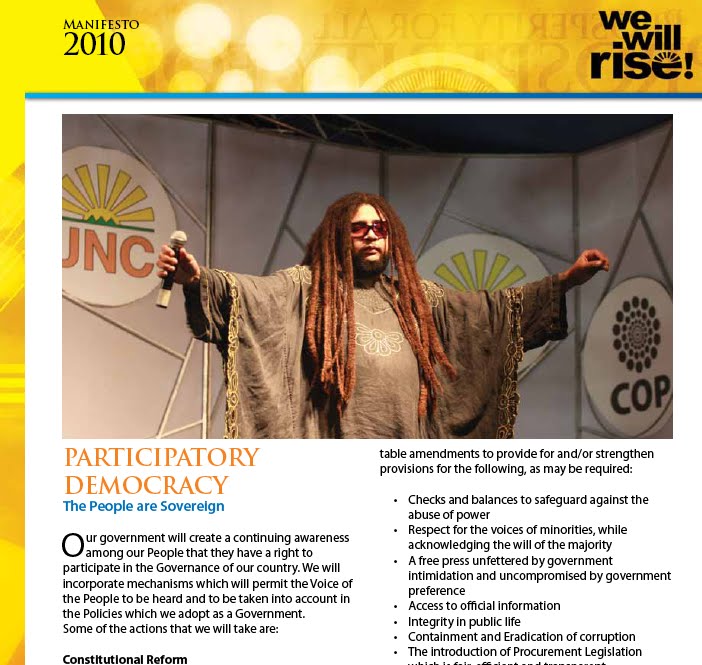
And oh, here's the local band Orange Sky's lead singer Nigel Rojas. Wearing a poncho of some sort? A moo moo? He presides over the section on Constitutional reform:
The layout is pretty straight-forward, perhaps in line with the party's stated aims of changing basic things? Whatever the case, the designers were not trying to rock the boat, just be effective. The pictures are carefully selected for human impact, not for dramatic show (drama appears to have been the approach of the PNM manifesto, reviewed here). All in all, the designers have succeeded in forging a balance between easy-to-read content and engaging images so you don't fall asleep, while not rocking the boat. Three and a half out of five stars.

But what do you think? SEE the full UNC/COP manifesto here. READ a review of the design of the PNM manifesto here.
VIDEO: Richard Rawlins' political buttons

Richard Rawlin's political buttons go on sale at Alice Yard next week Friday
Ninety-nine buttons up on a wall,
ninety-nine buttons upon a wall,
before the night’s done,
you should have bought them all,
ninety-nine buttons bought
off the wall
5/14/10
Nikolai Noel's MONO, a work in progress

From Nikolai Noel's work in progress MONO.
"Started working on these things this week - you would have to call them mono-prints of sorts, so I think I will call the lot of them MONO. I intend to do at least 12 of these ( 8in x 8in .) They are quite pleasant in person" -- Nikolai Noel at his blog.
I like the play of these images with ideas of the known, unknown and the patriotic. The choice of colour and near-monochrome, the form, the play on the silhouette; there is a sensibility here that is part of an aesthetic that is completely unique. These images make me think about nationality and its relationship to subjective experience, makes me question and critic the banal images of nationhood that flood primary school copy-books and want to interrogate their origins in a critical exercise of self-discovery. Yeah, I like.
SEE more here.
Art politik! Art politik!

Richard Rawlin's political buttons
Richard Rawlins is holding his first exhibition at Alice Yard, Woodbrook, Port-of-Spain, NEXT WEEK Friday.
"On this eve of silly season I'm launching the BUTTON PROJECT," he says. "It takes the shape of a multi-media exhibit, two short films and an exhibition of 99 buttons representative of my political musings over the years. The work is for sale as well. Hope to see you there."
Luis did this

5/13/10
Revanche @ studiofilmclub

FROM THE ORGANISERS:
Revanche (Götz Spielmann/Austria/2008/121')
A gripping thriller and a tragic drama of nearly Greek proportions, Revanche is the stunning, Oscar-nominated international breakthrough of Austrian filmmaker Götz Spielmann. In a ragged section of Vienna, hardened ex-con Alex (the mesmerizing Johannes Krisch) works as an assistant in a brothel, where he falls for Ukrainian hooker Tamara. Their desperate plans for escape unexpectedly intersect with the lives of a rural cop and his seemingly content wife. With meticulous, elegant direction, Spielmann creates a tense, existential, and surprising portrait of vengeance and redemption, and a journey into the darkest forest of human nature, in which violence and beauty exist side by side.
studiofilmclub
Building 7
Fernandes Industrial Centre
Eastern Main Road
Laventille
Port of Spain
check out studiofilmclub on facebook http://www.facebook.com/pages/City-Of-Port-Of-Spain-Trinidad-and-Tobago/Studio-Film-Club/118825031282
Thursday May 13 th
FREE!
doors open at 7:30pm and feature will start at 8:15pm
5/12/10
PNM manifesto reviewed, aesthetically that is!

Let's start with the cover. It's red. Which is what you would expect, red being one of the national colours, a PNM colour and also colour linked with love, which is at the heart of the PNM campaign this year (pun intended). But there is something sedate about this cover. It suggests stability, possibly. But is also open to being accused of being inert. Also, for a campaign focused on how much the party cares, the cover, as well as sections inside of the manifesto, have surprisingly few images of people. It's all about the boats, buses and NAPA. The font is classy, yet functional. But why that grey stripe? Grey suggests an area of uncertainty, amidst bold black bars and, arguably, undercuts the message of certainty/stability. But voters probably don't care about these things, of course.

This PTSC bus just happened to be parked in front of the controversial National Academy for the Performing Arts (NAPA) and was photographed for use in the section of the manifesto on works and transport. A bit snarky. Another picture of the inside of NAPA also appears early on in the document. It's very dramatic, but unfortunately it reminds people of the Artists Coalition of TT dossier prepared by Rubadiri Victor which lamented the flaws in the design of NAPA and the lack of consultation:

There are some interesting pages where care was taken to arrange the text in unconventional ways for a manifesto. Normally manifestos can be quite staid, but this one tried its hand at some spunkiness (but not too much--it is politics after all and you have to linger near the centre!) The result? Some pages that trigger your attention but are actually a little difficult to digest in the context of the function of a manifesto, which is normally about the way forward and a clear motion of turning page after page smoothly. But kudos for this kind of effort at least.

We also have the odd mood images like this one which appears to want to suggest wealth, power, energy. But might just be looked upon as boring. And dark:

This one, near the end, was more effective:

It all ends with, you guessed it, more red:

All in all, this was a good effort, with a few mis-steps. Three and a half out of five stars. But what do you think? SEE the entire PNM manifesto here. We await the UNC/COP manifesto which is scheduled to appear later this week.
5/8/10
Inside Leroy Clarke's home


5/7/10

5/5/10
Meet Haydée @ studiofilmclub

studiofilmclub
Building 7
Fernandes Industrial Centre
Eastern Main Road, Laventille
Port of Spain
check out studiofilmclub on facebook http://www.facebook.com/pages/City-Of-Port-Of-Spain-Trinidad-and-Tobago/Studio-Film-Club/118825031282
Thursday May 5th
FREE!
doors open at 7:30pm and feature will start at 8:15pm
La Collectionneuse (Eric Rohmer/France/1967/89')
In Rohmer’s first color film,and forth moral tale, a bombastic, womanizing art dealer and his painter friend go to a seventeenth-century villa on the Riviera for a relaxing summer getaway. But their idyll is disturbed by the presence of the bohemian Haydée, accused of being a “collector” of men.
The multifaceted, deeply personal dramatic universe of Eric Rohmer has had an effect on cinema unlike any other. One of the founding critics of the history-making Cahiers du cinéma, Rohmer began translating his written manifestos to film in the sixties, standing apart from his New Wave contemporaries, like François Truffaut and Jean-Luc Godard, with his patented brand of gently existential, hyperarticulate character studies set against vivid seasonal landscapes. This near genre unto itself was established with his audacious and wildly influential series “Six Moral Tales.” A succession of jousts between fragile men and the women who tempt them, the “Six Moral Tales” unleashed onto the film world a new voice, one that was at once sexy, philosophical, modern, daring, nonjudgmental, and liberating.
Bangaseed rocks out over at Outlish.com

Trinidad band Bangaseed. Photo courtesy Outlish.com/Mark Lyndersay
"Look up Bangaseed in a future edition of the Trini dictionary Côté ci Côté la, and instead of the hard fruit, maybe the faces of the four, young men who have adopted the name will be featured. Listed as the synonym will be 'rising star'. Until then though, being listed on the immensely popular urbandictionary.com is a sign of things to come.
"Taking lead from their name, these rockers 'go hard', and in their first months on the scene, since debuting in September 2009, they're building a steady following. With over 1,000 fans on Facebook, and scoring gigs alongside top-rated, local bands in the genre (think Orange Sky), their dedication is certainly bearing fruit..."
READ more at the cool online magazine Outlish.com here.
5/4/10
CRB version 2.5!

Detail from an untitled drawing by Christopher Cozier (2002), reproduced on the cover of the August 2004 CRB; courtesy the artist.
At long last the trail-blazing online version of the Caribbean Review of Books is on stream! Editor Nicholas Laughlin promises to bring more frequent installments of the journal than ever before. This is a very, very pleasing development.
"If the original Caribbean Review of Books — published from 1991 to 1994 in Jamaica — was CRB version 1.0, and the CRB as revived in 2004 in Trinidad was version 2.0, then perhaps this incarnation of the magazine before you now, dear reader, might be called version 2.5," Laughlin writes on the new CRB site.
"Because our new website, launched in time for our sixth anniversary, marks a shift in medium, but not in purpose, direction, or ambition. As in the twenty-one print editions we published between May 2004 and May 2009, the CRB will continue to provide serious (but not solemn) coverage of contemporary Caribbean books and writing via insightful, intelligent reviews and essays."
Thus far, the latest issue features Brendan de Caires on Exhibiting Slavery: The Caribbean Postmodern Novel as Museum, by Vivian Nun Halloran; F.S.J. Ledgister on Picasso, I Want My Face Back, by Grace Nichols; Lisa Allen-Agostini on Who’s Your Daddy? and Other Stories, by Geoffrey Philp; and a travel narrative by Vahni Capildeo, the the first installment of a longer essay about the writer’s visit to Delhi and Mumbai. Lots of good stuff to sink your teeth into already!
CHECK out the online CRB here.
Her eyes are closed

Art design shows

FROM THE ORGANISERS:
The Department of Creative and Festival Arts Faculty of Humanities and Education UWI invites you to exhibitions by the Final Year students of the BA and Certificate in Visual Arts “Art and Design Show 2010”
WHEN: Sunday 9 May 2010, 4:00 pm to Saturday 15 May 2010 - 9.00 am -5:00pm
WHERE: Department of Creative and Festival Arts, GORDON STREET, ST AUGUSTINE
Design Presentation and Open Discussion
“Designing our Context”
Tuesday 11 May 2010
10:00 am
UWI Open Campus Auditorium
GORDON STREET, ST AUGUSTINE
Certificate in Visual Arts Student Exhibition
Tuesday 18 May 2010
4:00 pm
Department of Creative and Festival Arts
GORDON STREET, ST AUGUSTINE
Exhibition continues until
Tuesday 25 May 2010 - 9.00 am -5:00pm
Contact for all events:
Mrs. Maria Cruikshank
663-2141 (direct line) or PBX: 662-2002 ext. 3622
5/2/10

I took this photo at Alice Yard on Friday

So depressing it was funny!
It was an interesting night, with some interesting visitors and a live arts cybershow (yes, leather masks were involved.) There was also some blatant product placement going on at Alice Yard too as the photo below clearly demonstrates. Either that or this was a piece called 'We've just turned off the projector but you can still stare at the screen if you want'. Kidding I just took a random shot of the thing when they were packing up. But I like the colour blue.


5/1/10
Tanya's 'Show and Tell' signs rocked

Abovegroup hosted journalist Michael Diebert at another great session of their 'Show and Tell' lecture series. I like these signs Trinidadian graphic designer Tanya Marie did for the event, posted at various points at the Fernandes Industrial Centre, Laventille, where the event took place on Friday.


